ShopDreamUp AI ArtDreamUp
Deviation Actions


Suggested Deviants


Suggested Collections


![[BTS] VMIN](https://images-wixmp-ed30a86b8c4ca887773594c2.wixmp.com/f/31618385-0558-47d8-ae0f-800baeb18dab/d9z0thf-028a3530-323c-4f32-a417-91d8be888b37.gif/v1/crop/w_150,h_80,x_18,y_0,scl_1,q_85,strp/_bts__vmin_by_sterzii_d9z0thf-92s-2x.jpg?token=eyJ0eXAiOiJKV1QiLCJhbGciOiJIUzI1NiJ9.eyJzdWIiOiJ1cm46YXBwOjdlMGQxODg5ODIyNjQzNzNhNWYwZDQxNWVhMGQyNmUwIiwiaXNzIjoidXJuOmFwcDo3ZTBkMTg4OTgyMjY0MzczYTVmMGQ0MTVlYTBkMjZlMCIsIm9iaiI6W1t7ImhlaWdodCI6Ijw9ODAiLCJwYXRoIjoiXC9mXC8zMTYxODM4NS0wNTU4LTQ3ZDgtYWUwZi04MDBiYWViMThkYWJcL2Q5ejB0aGYtMDI4YTM1MzAtMzIzYy00ZjMyLWE0MTctOTFkOGJlODg4YjM3LmdpZiIsIndpZHRoIjoiPD0xNTAifV1dLCJhdWQiOlsidXJuOnNlcnZpY2U6aW1hZ2Uub3BlcmF0aW9ucyJdfQ._0yLEaTwthiPwBOj98AQU8LBwuKV454OunL-k_z352c)
![[BTS] VMIN](https://images-wixmp-ed30a86b8c4ca887773594c2.wixmp.com/f/31618385-0558-47d8-ae0f-800baeb18dab/d9z0thf-028a3530-323c-4f32-a417-91d8be888b37.gif/v1/crop/w_92,h_80,x_18,y_0,scl_1,q_85,strp/_bts__vmin_by_sterzii_d9z0thf-92s.jpg?token=eyJ0eXAiOiJKV1QiLCJhbGciOiJIUzI1NiJ9.eyJzdWIiOiJ1cm46YXBwOjdlMGQxODg5ODIyNjQzNzNhNWYwZDQxNWVhMGQyNmUwIiwiaXNzIjoidXJuOmFwcDo3ZTBkMTg4OTgyMjY0MzczYTVmMGQ0MTVlYTBkMjZlMCIsIm9iaiI6W1t7ImhlaWdodCI6Ijw9ODAiLCJwYXRoIjoiXC9mXC8zMTYxODM4NS0wNTU4LTQ3ZDgtYWUwZi04MDBiYWViMThkYWJcL2Q5ejB0aGYtMDI4YTM1MzAtMzIzYy00ZjMyLWE0MTctOTFkOGJlODg4YjM3LmdpZiIsIndpZHRoIjoiPD0xNTAifV1dLCJhdWQiOlsidXJuOnNlcnZpY2U6aW1hZ2Uub3BlcmF0aW9ucyJdfQ._0yLEaTwthiPwBOj98AQU8LBwuKV454OunL-k_z352c)


Description
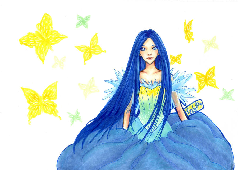
Sakura blue micron, copic sketch markers, and colored pencil on mixed media paper.
----------------------------------------------------------------------------
Artist self-critique, skip if you hate that type of thing:
Still not sure about this one. Based on an old watercolor sketch I did that was just too gorgeous (that dress) to let go. The butterflies didn't scan properly, I am still waiting to touch this up in photoshop.
I'm not sure how I feel about the blue lines, I worked hard on this but it looks like just a doodle(?) The missing hands is intentional but her right arm could have extended out a little more.
I like the concept but I'm just not sure it beats the original. I feel like I might do better. We'll see how the weekend goes.
Thanks for viewing and please tell me what you think!
Do you like the blue?
Should I do it over?
Aside from the anatomy obv, What would you do differently?
------------------------------------------------
other recent work:
Image size
3339x2390px 1.31 MB
© 2012 - 2024 BeckyPennArt
Comments7
Join the community to add your comment. Already a deviant? Log In
Pros: Wow, the woman in this picture is absolutely gorgeous! What a calm expression She's wearing such a lovely dress and the coloring really compliments the picture.
Cons: I mentioned I like the coloring, but in some areas it looks a little flat to me. For example the blue... flower I'm guessing doesn't have too much dimension. I see you put shading in the hair, but it stops suddenly nearing towards the petals. I feel the skin is kind of flat too; there are some red colors in there where the shadows are but I think it's missing a few more shades. I think the biggest problem right now is there's too much negative space. You have the butterflies there now but they're... just there. They're missing a couple of shades... or were you trying to have them fade into the background?
Suggestions: Quite simple really; add more shades. If those are flower petals, give them some dimension by adding shades and tints. Maybe even try to make a petal texture to it (so it feels like they're flower petals). Or maybe add more details to the flower like leaves. For the hair, continue what you've been doing for the entire hair and you should be fine. I think you can add one more shade to the skin; it doesn't have to be so dark but enough so others can identify it's a shadow. For the empty background, if you want to keep the white, why don't you add more flowers into the background. This gives a reason for the butterflies to be there. Or have some sort of fantasy scene going on.
Final thoughts: This is coming out great so far. Since this is only version 1, I think you have something else in mind than some of the suggestions. But this piece looks gorgeous so far. I can't wait to see the newer versions. Hope some of this critique helps you. Keep up the good work!